How to brand your repository with Tenejo
As a repository administrator, one of the most important things you can do is control the branding and appearance of your site. You want visitors to your site to have a consistent experience. You want to be able to change the look effortlessly.
Why Theme
A digital repository site is a great way to showcase your collections and works. Still, it's also important to make sure that your site is visually appealing. One way to do this is to theme your site. By carefully selecting colors, typography, and images, you can create a unique look that reflects your institutional brand. Additionally, a well-designed site can be more user-friendly and easy to navigate, making it more likely that visitors will find what they're looking for. So if you're looking to create a repository site that stands out from the rest, make sure to put some thought into its design. Tips for branding and theming
First, pay attention to the colors. They should be complementary to your brand colors and create a cohesive look. Second, choose a logo that is easy to recognize and consistent throughout device screen sizes. And finally, don't forget to preview your changes! Little changes to your institution's branding can make a big difference in creating a functional site.
Theming with Tenejo
With the Tenejo theming features, administrators can create a branded repository without relying on internal technical support or a development team.
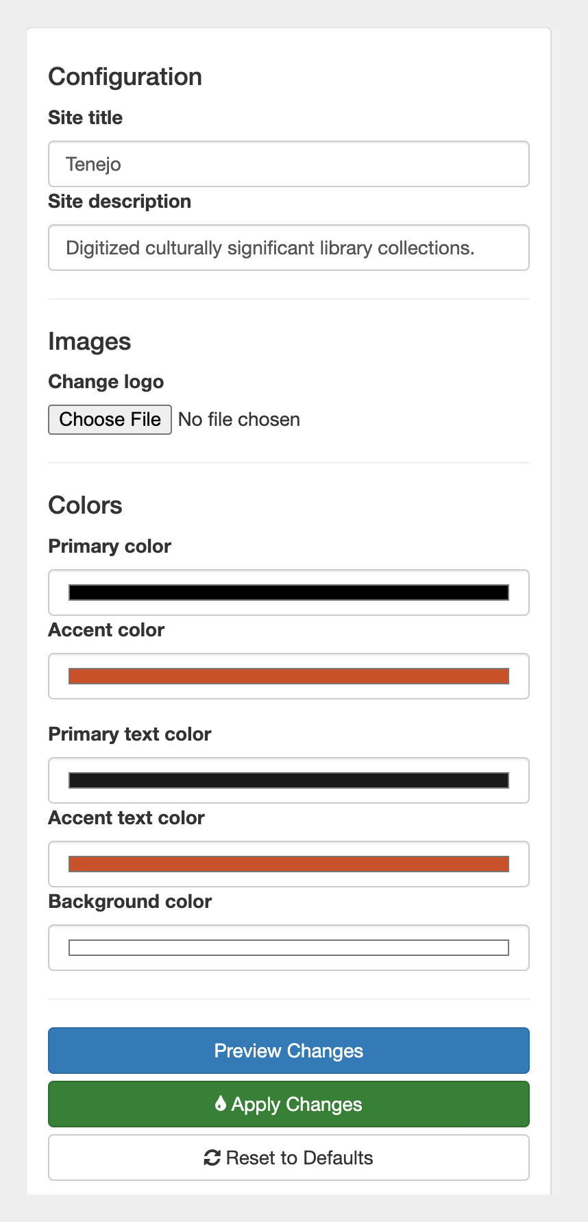
There are four components to theming in Tenejo.
- Site Title
- Site Description
- Logo
- Colors

Fig.1 - Dashboard -> Theme
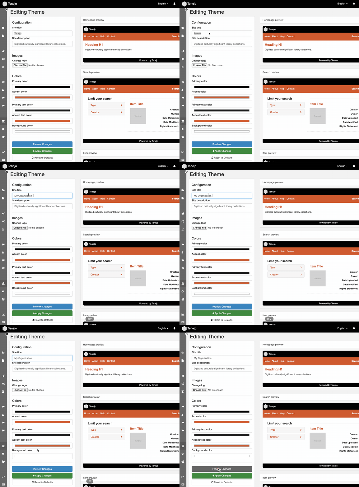
The Site Title updates the browser page title and the application name throughout your repository.

Fig.2 - Changing a site title
Your collection's Site Description will appear in the homepage search block. This description usually discusses why and what about your collection you want to share with other people.
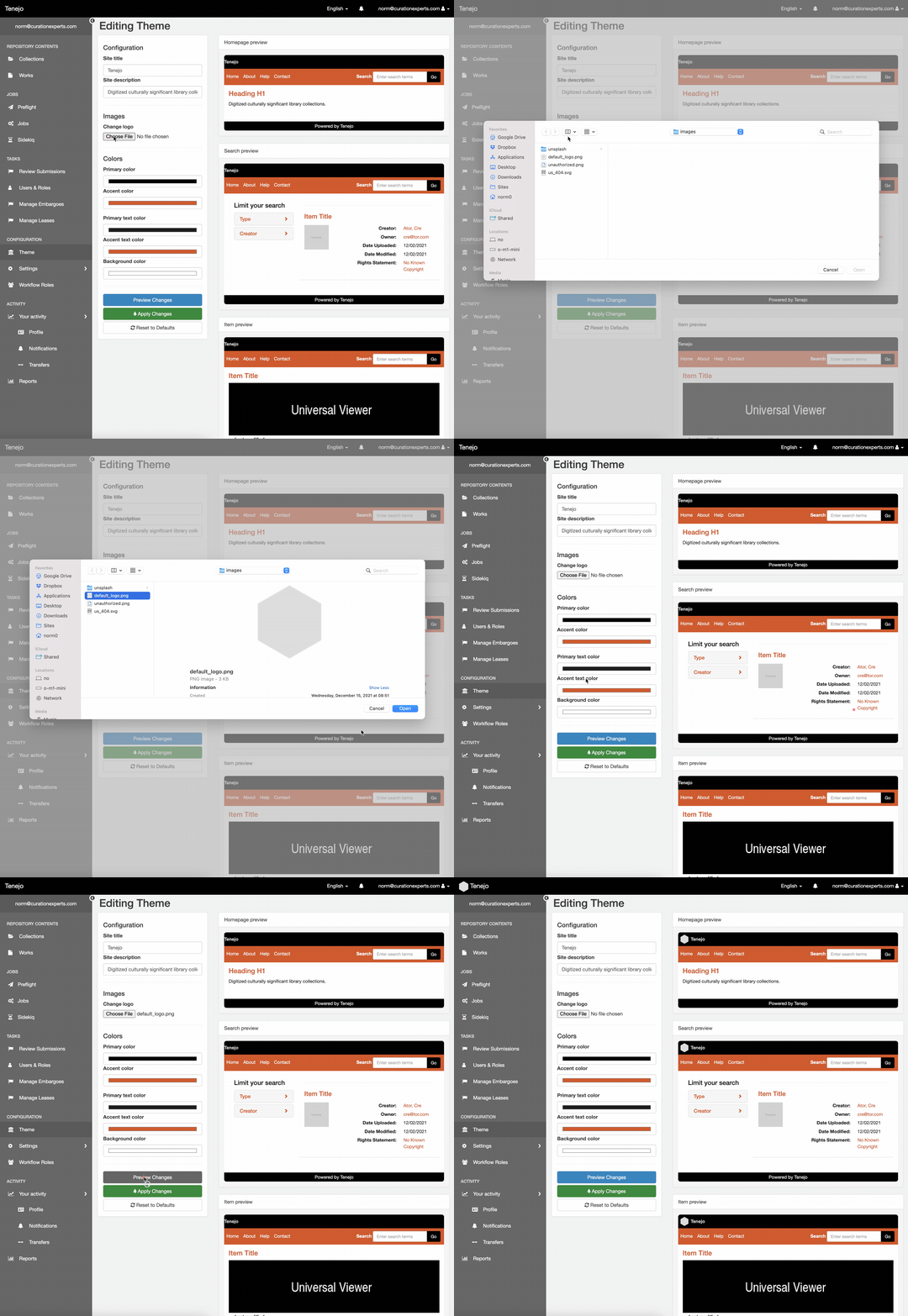
A Logo image will be displayed in the navigation bar at a specific height. It's a consistent height, so it can be seen and recognized on all device sizes, from mobile to big desktop computers.

Fig.3 - Previewing the logo
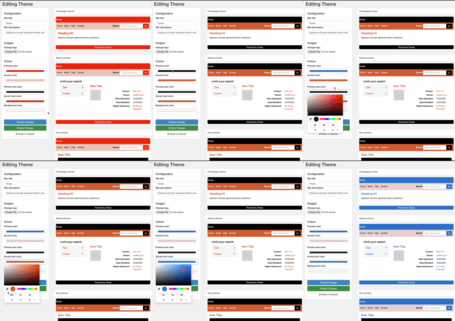
Here are five places you can change the Colors of your content and what they mean:
- The primary color changes the main navigation bar and buttons.
- The accent color is for the page navigation below the page title.
- The primary text is the main content that your users will be reading as they look at your works page.
- Accent text is for the links on the search results page and facet links.
- The background color can also be adjusted if needed.
Often your brand colors are not accessible but we’ve reduced that worry with correct color contrast inside color blocks such as buttons or the main navigation bar.

Fig.4 - Changing colors
You can preview all of these components before you apply them site wide. Additionally if you were experimenting you can always reset back to defaults. If you have brand guidelines that offer many color and logo choices, you can play and test which one works best for your repository.
Summary
Why theme your repository site? Because it can be a powerful way to create an immersive and engaging experience for your patrons. By following the tips we’ve outlined in this post, you can set up a theme that reflects your brand and drives engagement. Tenejo’s theming tools provide everything you need to build quickly and easily.
Are you interested to learn more about Tenejo? Let's chat. Check out the links below or shoot me an email.